Alana Collett
Graphic Communication and Illustration
I’m a persistent and positive person who loves a challenge, so as a designer I love to dive into the nitty gritty research before starting to create nuanced and unexpected outcomes that push boundaries.
Final year project
Joker / Flo-2 / Lost in Translation
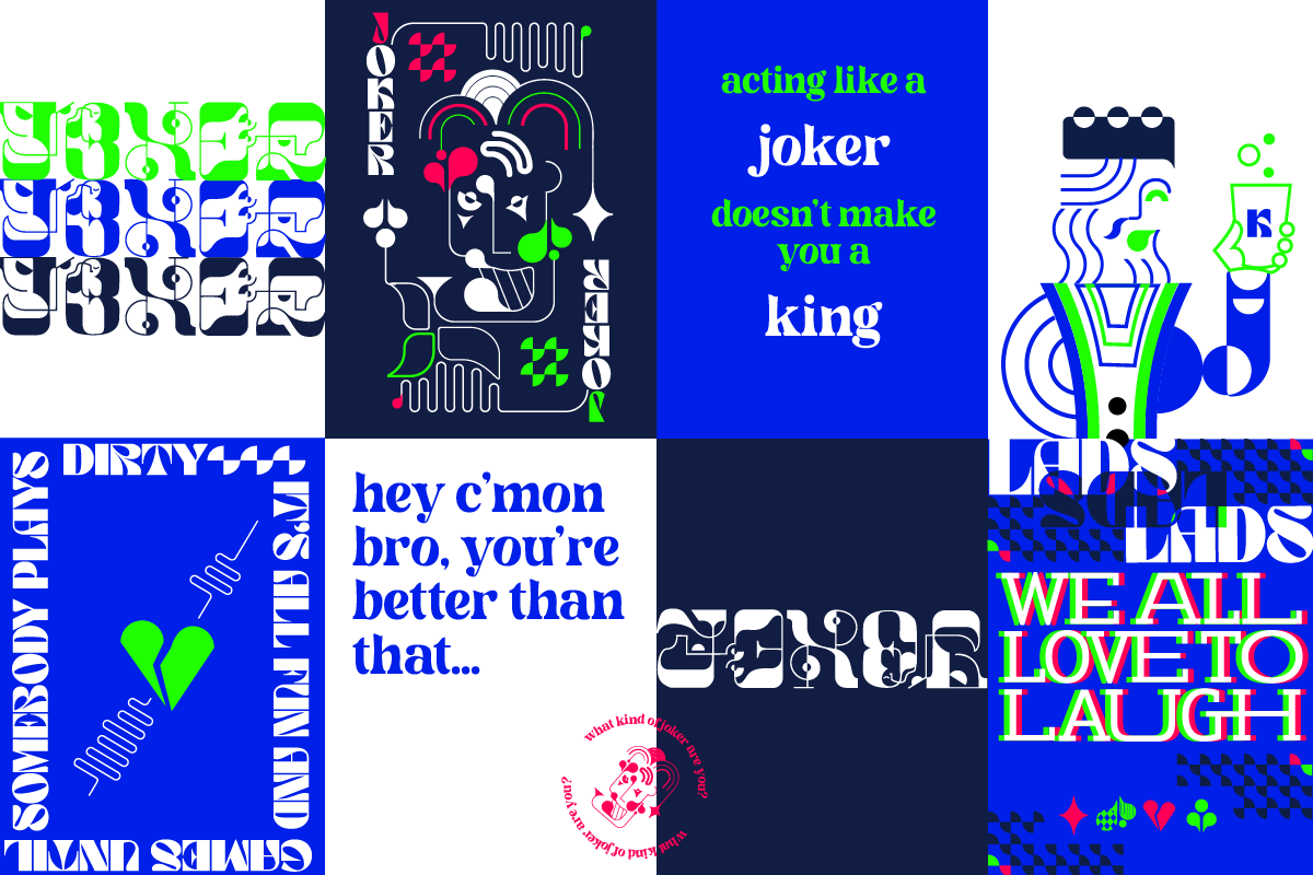
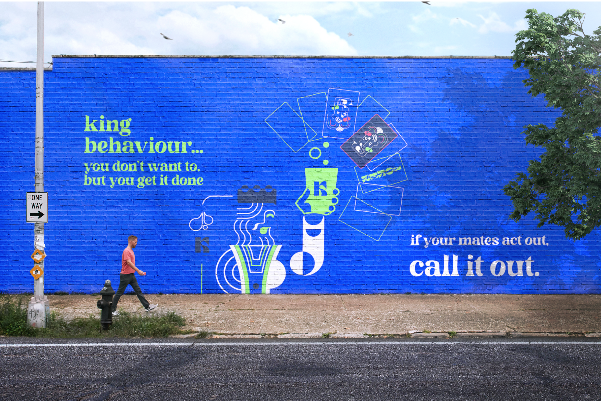
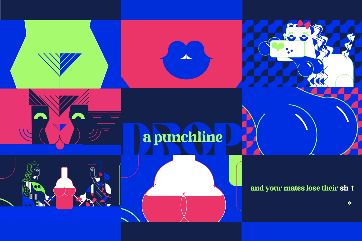
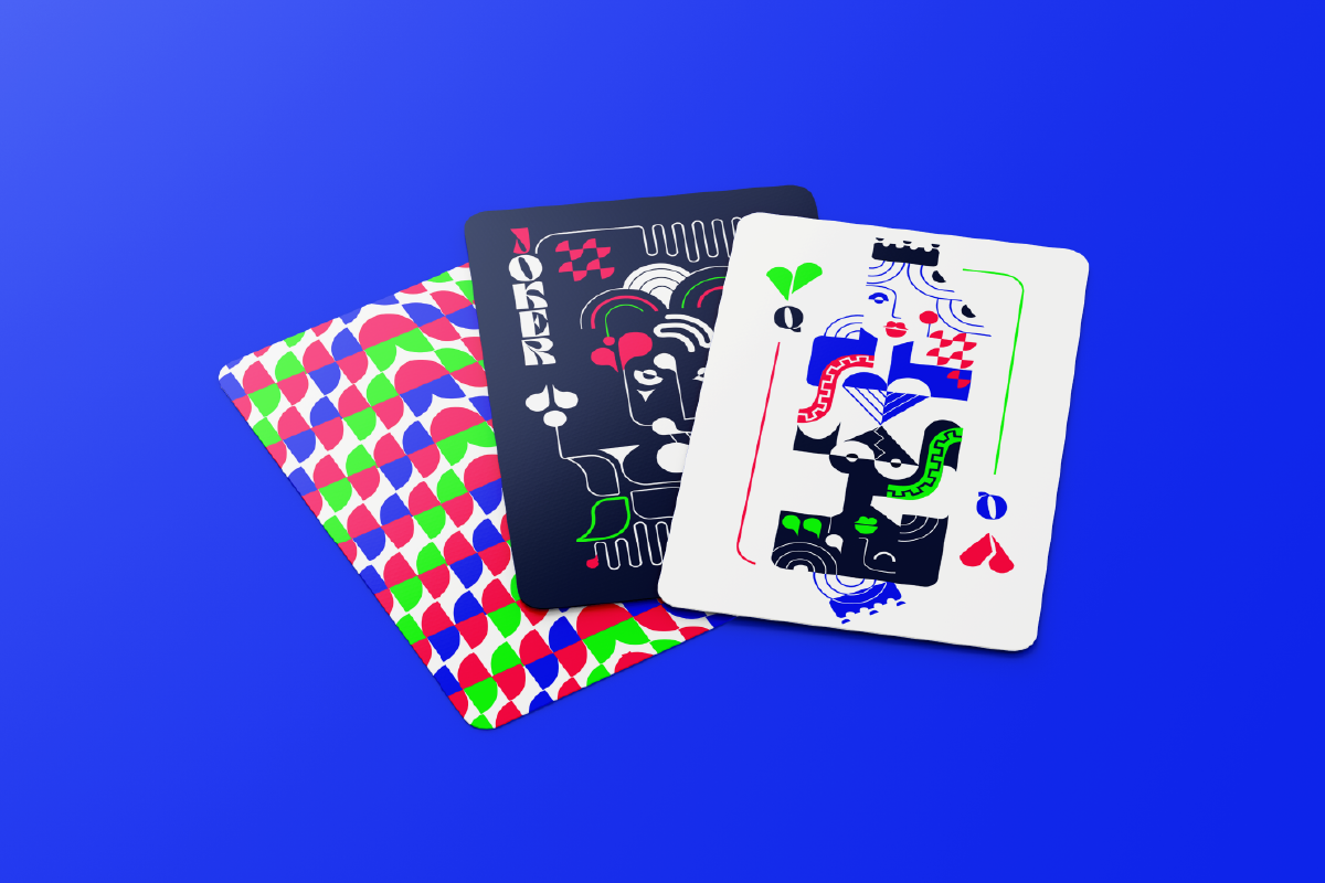
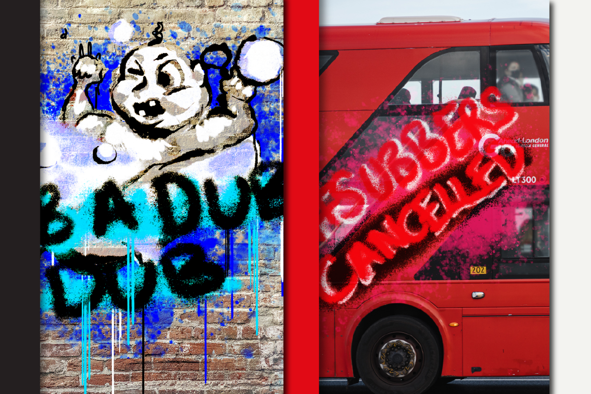
Joker
‘Joker’ is a disruptive music festival campaign challenging ‘lad culture’ and harmful jokes which normalise derogatory attitudes towards women; in doing so trivialising sexual assault and encouraging potential perpetrators.
As demonstrated by the defensive ‘#notallmen’ hashtag in response to media coverage on the topic, the conversation was developing two opposing sides when the solution to the reducing the problem lies in achieving unity. Therefore, the tone of voice was difficult to define as the campaign needed to avoid directing the blame or condescension and instead empower young men to correct any of their mates’ inappropriate ‘banter,’ rather than become a bystander in a progressing situation.
Joker
The visual language is inspired by a deck of playing cards, both due to the links with drinking games such as Ring of Fire / King’s Cup on nights out where sexual assault is prevalent.
Joker Animation Stills
See the video link for full animation
Joker
Playing on the idea of a joke having two sides to it – the alluring but mysterious ‘Joker,’ who runs through the campaign as a two-sided illustrated character, is posed at first as seemingly harmless before being revealed as potentially more sinister.
The other ‘picture’ characters also play a role in the narrative, showing alternate outcomes to a situation which places the viewer’s choice of whether to speak against misogyny early as the deciding factor in preventing a potential sexual assault.
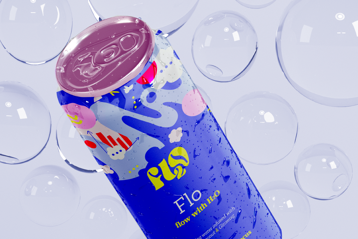
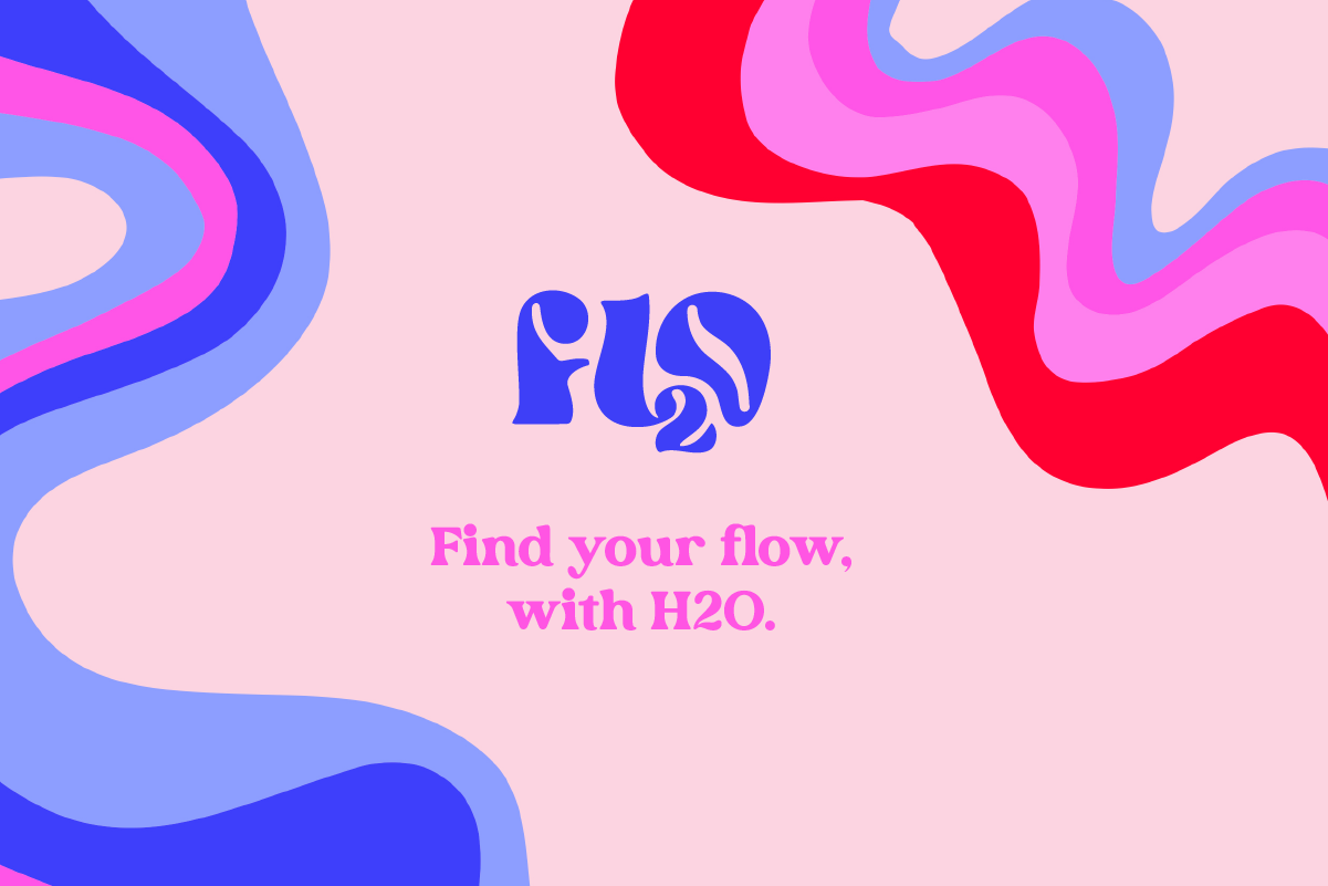
Flo-2
Whilst it is widely recognised that drinking water is good for our physical health, most people don’t realise that it is also tightly linked with our emotional well-being. Even a small drop in hydration levels can have a noticeable impact on brain function and clarity.
A group of people which this directly affects are those who commute to work. This is often during rush hour and can be stressful and tiring. As a result, they arrive at work already lacking hydration – not mentally prepared to work productively. Likewise, at the end of the day, they arrive home exhausted, rather than feeling fresh and ready to enjoy their time off.
Flo-2 is H2O like never before. Giving good old water a rebrand and a level up, by turning the essential liquid of life into an adaptable experience. Instead of forgetting to drink or gulping down a glass when they are already dehydrated, the brand flows into audiences’ busy and hurried schedules by serving ‘augmented’ water at different times of the day.
Flo-2
The brand identity is flamboyant and fun to appeal to a younger generation of commuters and inject character, fun and colour into their travel.
The logo is designed to read as ‘Flo’ but at the same time looks like the chemical formula for water; ‘H2O’. It is in a fluid style to represent the liquid water and the fluidity of the solutions on offer.
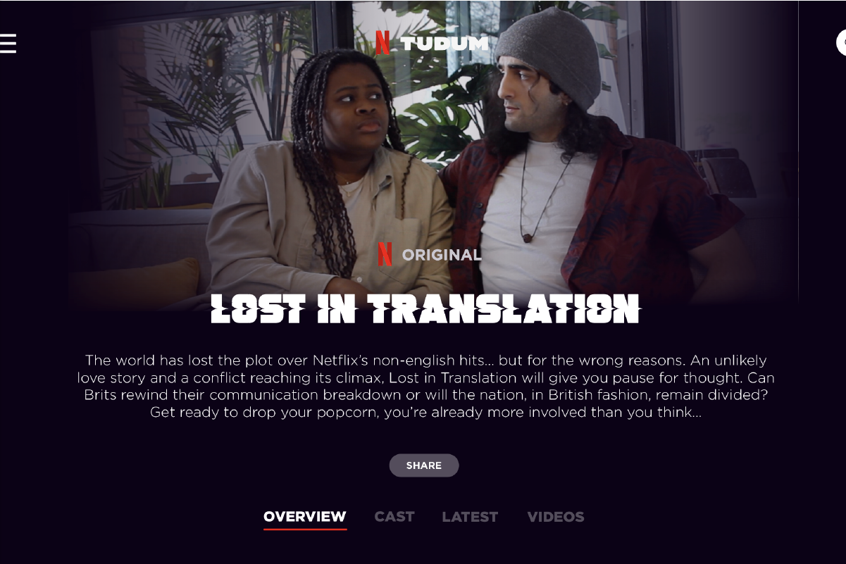
Lost in Translation
This was a joint project for the D&AD Netflix brief that I loved working on with Imogen Sandbach.
How do we create excitement and spark conversation around non-English language content when many Netflix viewers won’t give it a chance due to their assumptions that they will not relate to different cultures and scepticism towards the viewing experience?
Lost in Translation
Brits love humour, and the best way to create excitement is through entertainment. If there is one thing that will get Netflix viewers talking it’s the anticipated release of a new Netflix original. ‘Lost in Translation' is a Netflix original that looks at the cultural differences which build mistrust between the ‘Subbers’ and ‘Dubbers’. Whilst the documentary is delivered with a sense of humour and dramatizes a trivial matter, it does link to larger questions around what is considered ‘Foreign’ by British people, and how their perceptions may affect their viewing choices.
Alana Collett
Final year project
Joker / Flo-2 / Lost in Translation
Work Experience
I undertook the Year in Enterprise where I ran my own creative business for a year during the pandemic, specialising in branding small businesses. I discovered I have a strong entrepreneurial side and learnt so much about myself as a designer as well as how to deal with a range of clients.